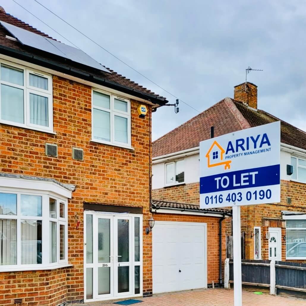
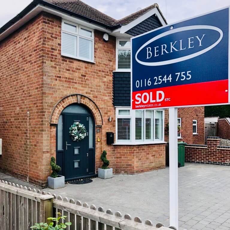
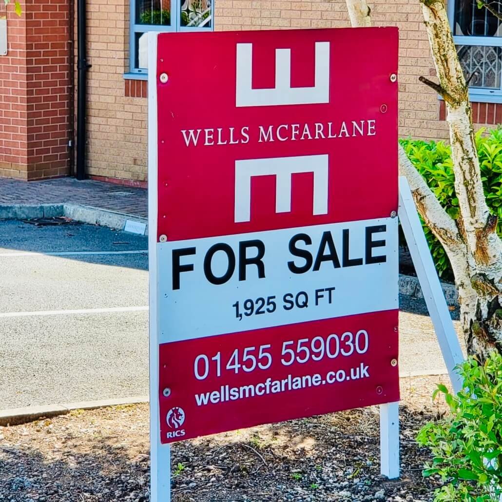
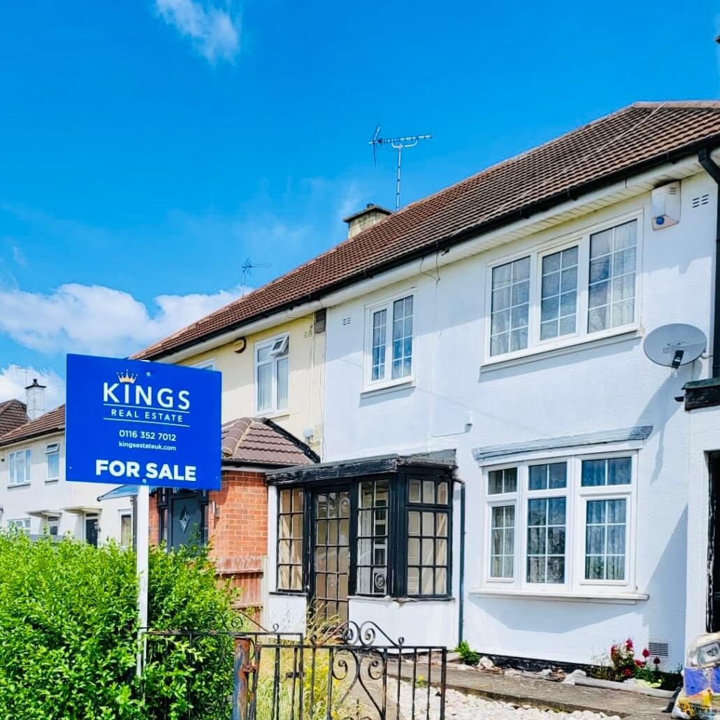
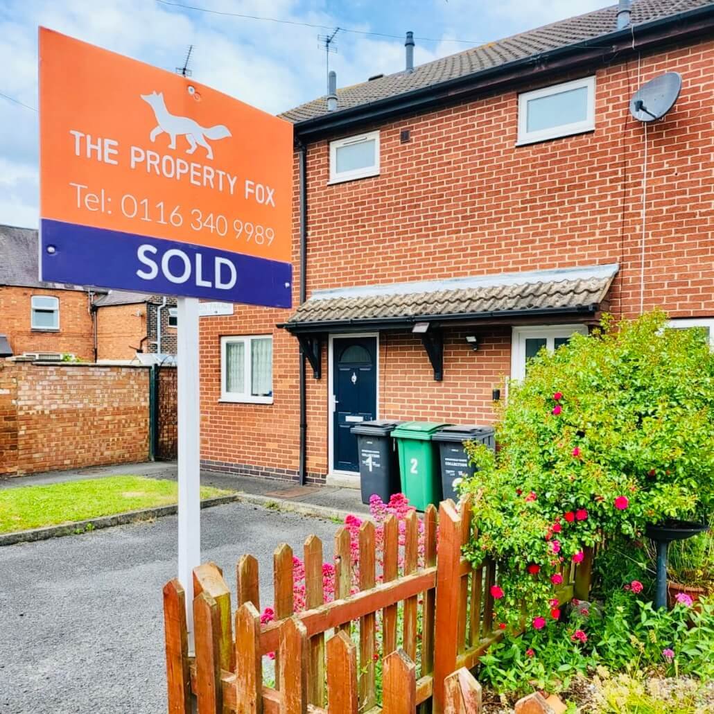
How important is Font on a Property Board?
Fonts are important in our lives now that we are interacting with brands on our mobile phones, TVs and computers. Design and branding is all around us and we can’t help but be influenced in our purchasing decisions, whether consciously or unconsciously.
Whilst visual branding and fonts can influence the perception of your brand, it’s vital to be sure that your chosen font conveys a positive business personality to your prospective customers as they walk or drive past your property boards. The single most important attribute for a good marketing font is to be clear and readable from a distance and when passing in a car. That makes the much plainer fonts such as Arial or Times New Roman much more appealing and whilst you may think of them as safe or even dull, they are incredibly easy to read, far more inclusive and are often used on information boards, in books and in newspapers where conveying an accurate message is vital. Both of these fonts (and others like them) also imply a feeling of trust and a sense of authority too.
If in doubt about which font to choose, we have 11 years’ expereince of working with property boards. We are happy to speak to you about how to turn your message into the most effective property board out there on the streets!